You can change the colors, fonts, buttons, images, and other components of the UI on the Branding page. As you make changes, they appear in the corresponding examples on the page.
Required Permissions for Branding
In order to access the Branding page and make changes to branding settings at the organization level, your user account must have manageUiBranding privilege permissions. To enable branding changes at the customer level, your user account must have customAdmin privilege permissions.
In order to access the Branding page and make changes to branding settings, your user account must have Customer Administration privilege permissions. To request permissions or grant them to a user, contact Technical Support.
Managing Branding Settings
To access Branding, click the Branding icon on the left-side primary menu.
Selecting the Level
You can manage and apply branding settings at either the organization or customer level. At the customer level, branding affects all organizations, accounts, and user underneath that customer, although individual organizations under the customer can override them by managing their own branding. At the organization level, branding will affect all accounts and users underneath their organization. The default level is set to Organization in order to avoid incidental changes to branding at the customer level.
Select the level at which your branding settings will apply from the Level dropdown In the top-right corner of the Branding menu. You will only see the level(s) whose settings you have permissions to edit; contact your account administrator for assistance with role-based access control and related permissions.
Applying or Resetting Changes
After making any changes to the Branding settings, you must click Save at the bottom-right of the Branding page for the changes to take effect. You can also click Reset to discard
Branding Settings
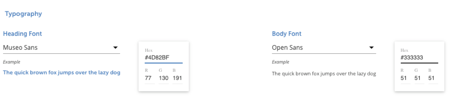
Typography
In the Typography section, you can manage the font, size, and color (via hex code or RGB value) of the text within the Cloud Elements platform. You can specify text styles for both heading and body text. Available fonts are a combination of both web-safe and Google-provided fonts featuring a complete range of properties.
Available Google Fonts (click to expand)
- Alegreya
- Alegreya SC
- Alegreya Sans
- Alegreya Sans SC
- Archivo
- Archivo Narrow
- Asap
- Asap Condensed
- Barlow
- Barlow Condensed
- Barlow Semi Condensed
- Cabin
- Chivo
- Cormorant
- Cormorant Garamond
- Cormorant Infant
- Crimson Text
- EB Garamond
- Exo
- Exo 2
- Faustina
- Fira Sans
- Fira Sans Condensed
- Fira Sans Extra Condensed
- Josefin Sans
- Josefin Slab
- Kanit
- Lato
- Libre Franklin
- Manuale
- Merriweather
- Merriweather Sans
- Montserrat
- Montserrat Alternates
- Muli
- Museo Sans
- Neuton
- Nobile
- Nunito
- Nunito Sans
- Open Sans
- Overpass
- Playfair Display
- Playfair Display SC
- Poppins
- Prompt
- Proza Libre
- Raleway
- Roboto
- Roboto Condensed
- Rubik
- Sansita
- Source Sans Pro
- Spectral
- Spectral SC
- Taviraj
- Titillium Web
- Trirong
- Ubuntu
- Vollkorn
- Zilla Slab
Available Web-Safe Fonts (click to expand)
- Arial
- Arial Black
- Comic Sans MS
- Courier
- Courier New
- Helvetica
- Courier New
- Georgia
- Garamond
- Impact
- Lucida Console
- Lucida Sans Unicode
- Palatino
- Tahoma
- Times New Roman
- Trebuchet MS
- Verdana
- Symbol
- Webdings
- Wingdings
- MS Sans Serif4
- MS Serif4
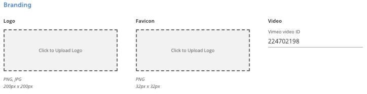
Branding
In the Branding section, you can upload a logo that will be displayed in the top-left corner of the platform and in custom element logs, and a favicon that will be used as the browser tab title icon.
| Image Type | Acceptable File Type(s) | Optimum Resolution |
|---|---|---|
| Logo | PNG, JPG | 200px x 200px |
| Favicon | PNG | 32px x 32px |
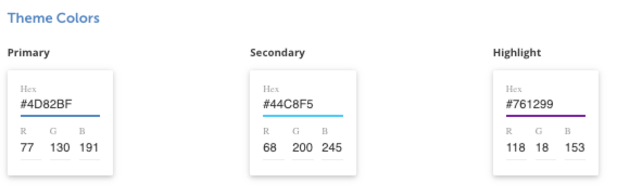
Theme Colors
In the Theme Colors section, you can manage and specify the colors (via hex code or RGB value) of the theme used in Cloud Elements.
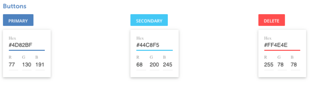
Buttons
In the Buttons section, you can manage and specify the colors (via hex code or RGB value) of the three button types used in Cloud Elements platform.
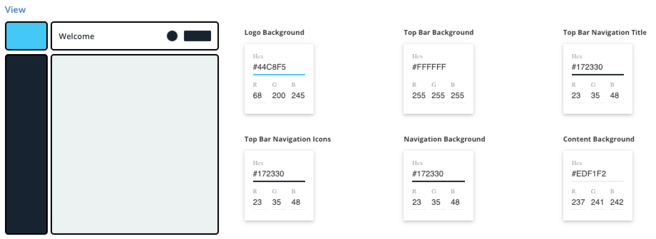
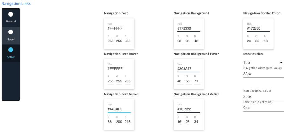
View and Navigation Links
In the View and Navigation Links sections, you can manage and specify the colors (via hex code or RGB value) of the top toolbar and left-side primary menu.
In the Navigation Links section, you can also specify the colors, sizes, and positions of the icons themselves.
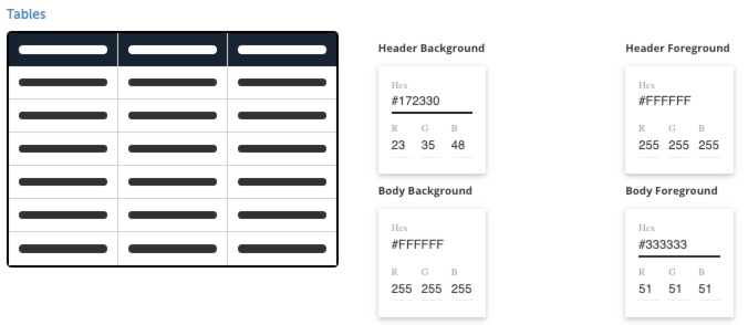
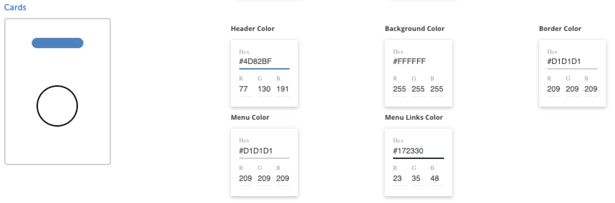
Components (Tables and Cards)
In the Components section, you can manage the appearance of the tables and cards used in the Cloud Elements platform.
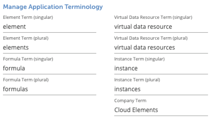
Manage Application Terminology
In the Manage Application Terminology section, you can manage the various terms used within Cloud Elements. You can customize the specific terms used for elements, formulas, virtual data resource, and the company.
Customized terminology will not apply to the following:
- error messages
- URLs (although you can change URLs in the Manage Primary Menu section)
- Pendo UI guides or content
- Cloud Elements cookie banner and privacy policy
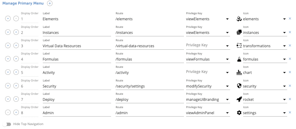
Manage Primary Menu
In the Manage Primary Menu section, you can manage the links, icons, and style of the primary menu on the left-hand side. You can add or remove primary menu items, or customize existing items. The following table lists and describes the different options you can configure for primary menu items:
| Option Name/Column | Description |
|---|---|
| Display Order | The priority in which the item is shown in the primary menu. Click the arrow buttons or enter a number in the Display Order column to change an item's priority. Note: For best functionality, we recommend defining a sequential display order by assigning each menu item its own number instead of relying only on the arrow buttons. |
| Label | The text to appear on the menu item and link. |
| Route | The URL path to which the menu item links, appended to your domain (e.g. /elementwould link to www.MyCoolSite.com/element) |
| Privilege Key | (Optional) If assigned, a privilege type a user account must have in order for the menu item to be displayed in their primary menu and hidden from all users lacking privilege. If unassigned, all users, regardless of account permissions, will see and have access to the primary menu item. |
| Icon | The image displayed in the primary menu item link. The icon selected only applies to the primary menu item's button and does not affect the larger use of the selected icon throughout the interface. |
You can also hide the interface's top navigation bar by enabling the Hide Top Navigation toggle in this section.
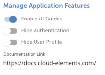
Manage Application Features
In the Manage Application Features section, you can customize these additional features:
- Enable UI Guides: enables or disables the in-app messaging and guides used within the application. These guides are not customizable, but they can be disabled using this setting.
- Hide Authentication: hides/masks the Cloud Elements authentication tokens in the user interface
- Hide User Profile: enables or disables the user profile button in the bottom-left corner of the application. This is recommended if the user logout process is handled in another area of the application when single sign-on (SSO) is used.
- Documentation Link: the URL for your platform's user documentation
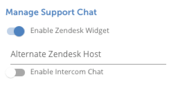
Manage Support Chat
In the Manage Support Chat section, you can enable Zendesk or Intercom support chat.
Importing and Exporting Branding via cURL
You can customize the look and feel of your Cloud Elements UI. To help modify a branded UI, use the following example curl commands to export your current settings for backup or transfer, and import or restore settings to your account.
Save or Export your Cloud Elements Branding
This is valuable in being able to quickly capture your current branding to use as a template in other workspaces. The JSON format allows you to easily share internally and upload to a public repo.
| Headers | |
|---|---|
| Authorization | User {{userSecret}}, Organization {{orgSecret}} |
| Content-Type | application/json |
Example request:
curl --location --request GET "https://api.cloud-elements.com/elements/api-v2/branding" \
--header "Authorization: User {{userSecret}}, Organization {{orgSecret}}" \
--header "Content-Type: application/json"
Restore or Import your Cloud Elements Branding
If you've mistakenly saved the wrong branding settings or want to quickly revert to an earlier version of your settings, use the example below to reset your branding and see all available fields with which you can import new branding across accounts.
| Headers | |
|---|---|
| Authorization | User {{userSecret}}, Organization {{orgSecret}} |
| Content-Type | application/json |
Example request:
curl --location --request PUT "https://api.cloud-elements.com/elements/api-v2/organizations/branding" \
--header "Authorization: User {{userSecret}}, Organization {{orgSecret}}" \
--header "Content-Type: application/json" \
--data "{
\"headerFont\": \"\\\"Museo Sans\\\", museo-sans\",
\"headerColor\": \"#4d82bf\",
\"bodyFont\": \"\\\"Open Sans\\\", open-sans\",
\"bodyColor\": \"#333333\",
\"logo\": \"\",
\"favicon\": \"\",
\"themePrimaryColor\": \"#4d82bf\",
\"themeSecondaryColor\": \"#44c8f5\",
\"themeHighlightColor\": \"#761299\",
\"buttonPrimaryBackgroundColor\": \"#4d82bf\",
\"buttonPrimaryTextColor\": \"#ffffff\",
\"buttonSecondaryBackgroundColor\": \"#44c8f5\",
\"buttonSecondaryTextColor\": \"#ffffff\",
\"buttonDeleteBackgroundColor\": \"#FF4E4E\",
\"buttonDeleteTextColor\": \"#ffffff\",
\"logoBackgroundColor\": \"#44c8f5\",
\"topBarBackgroundColor\": \"#ffffff\",
\"navigationBackgroundColor\": \"#172330\",
\"contextBackgroundColor\": \"#edf1f2\",
\"cardHeaderColor\": \"#4d82bf\",
\"cardBackground\": \"#ffffff\",
\"cardMenuBackground\": \"#d1d1d1\",
\"cardMenuLinkColor\": \"#172330\",
\"navigationLinkBackground\": \"#172330\",
\"navigationLinkForeground\": \"#ffffff\",
\"navigationLinkBackgroundHover\": \"#303a47\",
\"navigationLinkForegroundHover\": \"#ffffff\",
\"navigationLinkBackgroundActive\": \"#101922\",
\"navigationLinkForegroundActive\": \"#44c8f5\",
\"topBarNavigationColor\": \"#172330\",
\"tableHeaderBackground\": \"#172330\",
\"tableHeaderForeground\": \"#ffffff\",
\"tableBodyBackground\": \"#ffffff\",
\"tableBodyForeground\": \"#333333\",
\"intercomEnabled\": false,
\"pendoEnabled\": true,
\"documentationUrl\": \"https://docs.cloud-elements.com/home\",
\"navigationIconPosition\": \"top\",
\"navigationIconSize\": \"20px\",
\"navigationLabelSize\": \"9px\",
\"navigationWidth\": \"80px\",
\"elementSingularTerm\": \"element\",
\"elementPluralTerm\": \"elements\",
\"formulaSingularTerm\": \"formula\",
\"formulaPluralTerm\": \"formulas\",
\"vdrSingularTerm\": \"virtual data resource\",
\"vdrPluralTerm\": \"virtual data resources\",
\"instanceSingularTerm\": \"instance\",
\"instancePluralTerm\": \"instances\",
\"companyTerm\": \"Cloud Elements\",
\"componentsBorderColor\": \"#d1d1d1\",
\"topBarTitleColor\": \"#172330\",
\"navigationItemBorderColor\": \"#172330\",
\"navItems\": [
{
\"label\": \"Admin\",
\"icon\": \"settings\",
\"route\": \"/admin\",
\"order\": 8,
\"privilegeKey\": \"viewAdminPanel\"
},
{
\"label\": \"Deploy\",
\"icon\": \"rocket\",
\"route\": \"/deploy\",
\"order\": 7,
\"privilegeKey\": \"manageUiBranding\"
},
{
\"label\": \"Security\",
\"icon\": \"security\",
\"route\": \"/security/settings\",
\"order\": 6,
\"privilegeKey\": \"modifySecurity\"
},
{
\"label\": \"Activity\",
\"icon\": \"chart\",
\"route\": \"/activity\",
\"order\": 5
},
{
\"label\": \"Formulas\",
\"icon\": \"formulas\",
\"route\": \"/formulas\",
\"order\": 4,
\"privilegeKey\": \"viewFormulas\"
},
{
\"label\": \"Virtual Data Resources\",
\"icon\": \"transformations\",
\"route\": \"/virtual-data-resources\",
\"order\": 3
},
{
\"label\": \"Instances\",
\"icon\": \"instances\",
\"route\": \"/instances\",
\"order\": 2,
\"privilegeKey\": \"viewElements\"
},
{
\"label\": \"Elements\",
\"icon\": \"elements\",
\"route\": \"/elements\",
\"order\": 1,
\"privilegeKey\": \"viewElements\"
}
],
\"videoId\": \"224702198\",
\"topNavBarHidden\": false,
\"userProfileHidden\": false,
\"cloudElementsAuthMasked\": false
}"To change the branding on “powered by” field and the logo for Standardized Authorization/Ezra add includeCETaglineLink: false to the branding payload.
Open Ezra's branding URL: https://provisioning.snapshot.us.cloudelements.io/branding
or access the Staging version at: https://provisioning.staging.us.cloudelements.io/branding
- Go to Links > Show CE Links to update the powered by field.
- To update the logo, go to logo field. You can also provide the logo via branding or the application API. Upload the logo in an element and use the generated s3 / CE images URL.
